
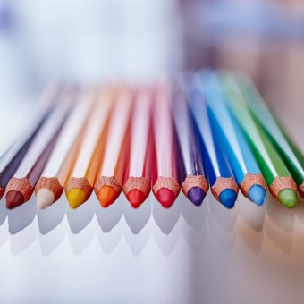
Every person has an individual colour preference. Colours appeal to people’s emotions and—as a result—they can be quite a persuasive tool in marketing. There is some disagreement among marketing experts about the usefulness of the psychology of colour, but many common colours impact the way we feel. Because of this, colour can be used to influence people’s decisions when visiting a website. Colours can also act as brand identifiers and can assist in conveying information. Here are 5 ways to use colour to boost conversion rate.
Define your brand personality
Every iconic brand has a distinct colour palette. Think about the golden arches and bold red of Mcdonald’s, the slick, dark blue of Ralph Lauren, or Coca Cola’s deep shade of red. Consistent colours in a brand create a sense of trust between the brand and the customer. This kind of consistency is useful for any brand because the customer equates the impression a business gives, with the reputation of the business itself. Our brains process images 60,000 times faster than text, so distinct colour is a shortcut to reminding a customer about a particular brand.
Create the right first impression
Colour can impact many things, from your emotions to your energy level and your general perception of a brand. This is why, when choosing your website’s layout, you need to be careful about which colours you choose. Studies have revealed that blue builds trust in people, while red creates a sense of urgency and black represents power and sleekness. Each colour is like a trigger for a certain reputation, so you need to consider what you want to sell to customers and how you want to sell it. On their homepage, Milani Cosmetics uses an appealing shade of pink, because pink denotes true love and can represent harmony, affection and inner peace.
Consider Your demographic
Philip Cohen, a professor of sociology at the University of Maryland, conducted a study in which he asked 2,000 men and women what their favourite colour was. For both genders, the most common response was ‘blue’, with purple coming in second for women and green for men. Other studies, such as research done by the people at KISSmetrics, show that women hate orange, brown and grey colours. It’s important to consider who your target demographic is, so you can adjust the appearance of your webpage or logo design accordingly. Colour isn’t everything when it comes to sales, but people clearly respond differently to certain colours.
Break the mould
When Heinz Green Ketchup came on the market, over 10 million bottles were sold in seven months. Apple Computers introduced the vividly coloured 1998 iMacs, which consumers fell in love with. These bold, sometimes strange, marketing ploys all have something in common: the businesses looked at the predominant designs in their competition and decided to try something different. Colour is an incredibly effective way to do this.
While all the proven studies on colour demonstrate that people identify with things they know, one way to stay ahead of the curb is to think outside of the norm. The peculiar colour scheme of the famous Google logo almost seems child-like when you look at it. Ruth Kedar, Google’s graphic designer, explains that they wanted to use primary colours (blue, red, yellow), while using a secondary colour on the ‘L’ because ‘Google doesn’t follow the rules.’