

In the digital world, no one likes change. Unless it’s a change that we asked for, of course. (Like Instagram finally reverting back to a news feed that’s more chronological and gives us the option to display latest posts!)
These updates keep us on our toes and often remind us that the big digital players think they know what we want, better than we do. They’re not just limited to social media channels, though. Google has given its AdWords interface a recent makeover – and it’s implemented some serious changes.
Given that the advertising platform has been largely the same since 2008, maybe it was time for a change. Lots of PPC marketing specialists don’t think so, and the new look has gone under fire with a fair share of criticism.
We’re finding that it’s not all as daunting as you may think. Like all changes, there are good and bad points to the Google AdWords updates. We’re going to show you how to get your head around the new interface and make the most of some of the more useful changes.
What We Don’t Like About the Google AdWords Updates
Here are the updates in the new interface that we’re struggling to accept.
Certain Functions are Harder to Find
The new interface offers a cleaner, more modern display that’s largely rid of unrelenting tables of data.
So, where’s the problem? The new look has rattled the cage of those that have been using AdWords for years and know their way around as well as their daily route to work. Now, some of the most-used functions, such as the Dimensions tab, have been buried in menus within menus, and they’re taking longer to navigate to.

No More Toggling between Pages
With the old design, we could easily click the top-right previous and next buttons within a campaign to switch between ad groups. This was useful to check out keywords in each ad group quickly for easy access to comparisons.
That’s gone. It’s been replaced by arrows that change the date range instead of the page. When we want to check out the stats on the next ad group, we have to go right out of the campaign and then look for the next one.
It’s not the end of the world, but it takes more time and increases the chance of losing our place in the sequence.
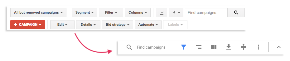
Labels have been Replaced
The new AdWords updates include a replacement of labels with icons and symbols. Before, we could easily see where we could find tabs like segments, filters and columns. Now, possibly in a bid to create a cleaner-looking design, these tabs can only be found with symbols.
It’s less clear what each tab does and will take some getting used to.
Here’s What We’re Enjoying
Here are the updates that we’re big fans of.
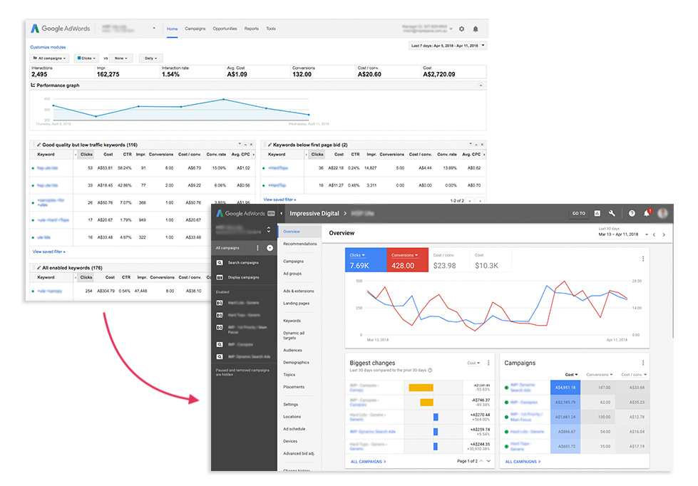
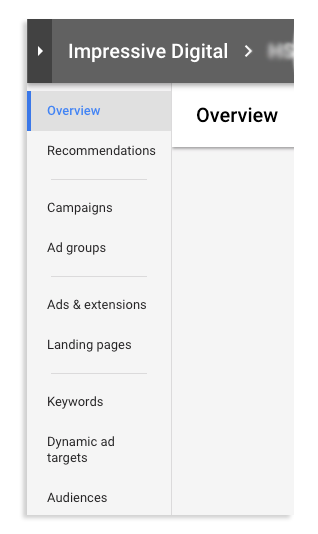
The Overview
At first glance, the overview/home tab looks sleeker and sexier than it did before. The old interface was a little overwhelming and threw heaps of data at the user in a layout that didn’t appear to have the structure needed for such vast amounts of numbers.
The new update makes top-level data that much easier to visualise, so AdWords newcomers aren’t as likely to be scared off when they need to extract info. Graphs are clearly colour-coordinated, and users can view a quick overview of their campaigns and biggest changes from the last 30 days.
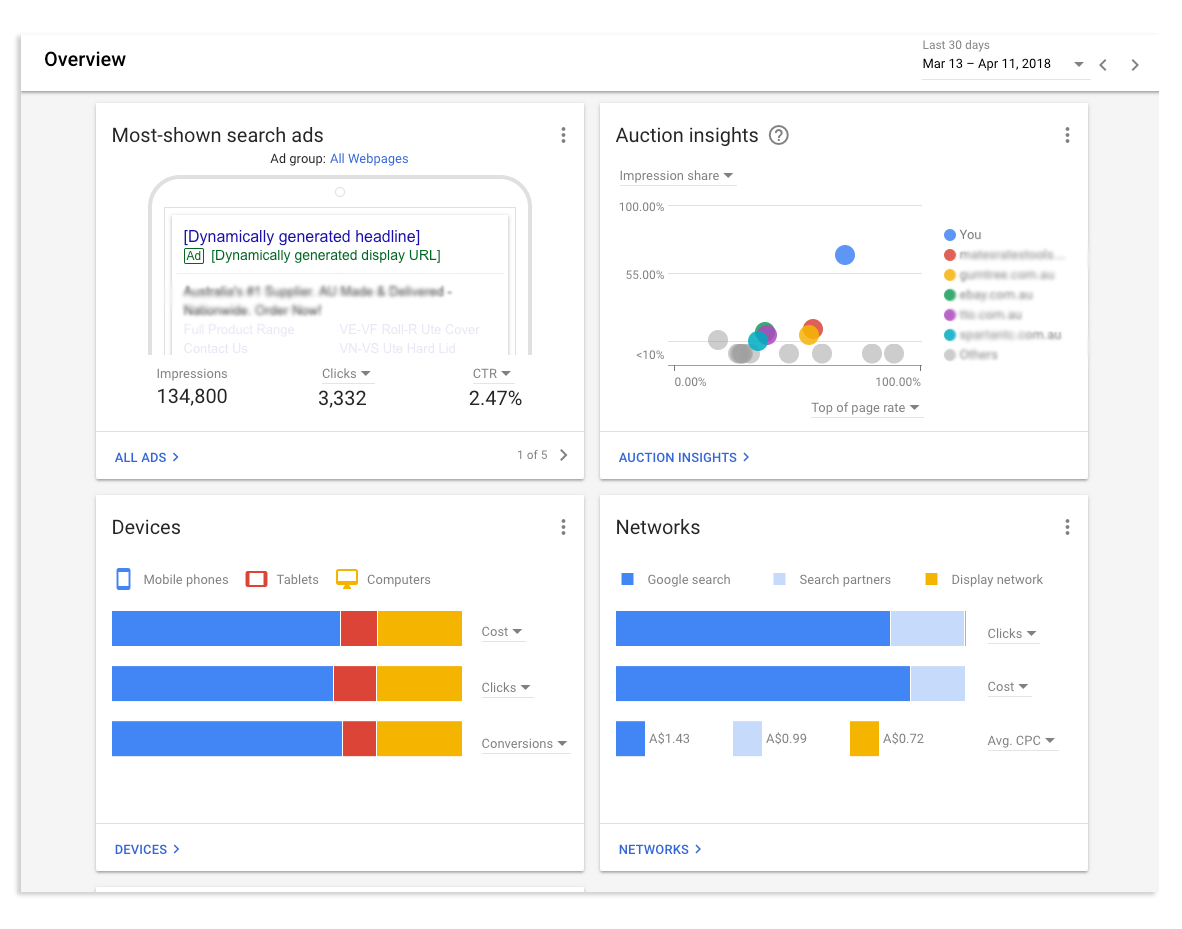
Further down, you’ll find some clean-looking buttons to visualise top-spending keywords and get instant information about the elements of your strategy that are performing best.
Scroll down some more for quick dashboard access to analytics of your performance on each network, device and the best times and days to post in terms of success. There is also a visually-clear graph to offer insights into your Google AdWords auction.
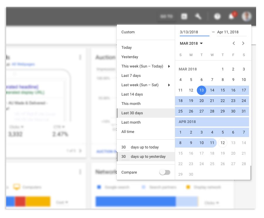
The Time Window
The time navigation window has had some updates that we’re finding to be extremely useful – they’re the changes we never knew we needed. Google has made the function scrollable, so you can highlight dates in the calendar without having to type in the date range. (Though, you can still do that, if you prefer.)
You can also now set the date range to whatever you want, so you’re no longer confined to pre-defined date ranges.
Improved Logic
The AdWords interface update is making it easier to jump between campaigns, ad groups and anything nested within these features. Campaigns are designed in a layered format; keywords and ads nestle within Ad groups, which nestle within campaigns.
The new interface makes much more sense of the formatting when you think of it this way. You can now see that account level information – the overview – is at the top, and nestled features flow below that.
The layers are listed on the left-hand side and make it easy to navigate to different targeting options.
More Specificity
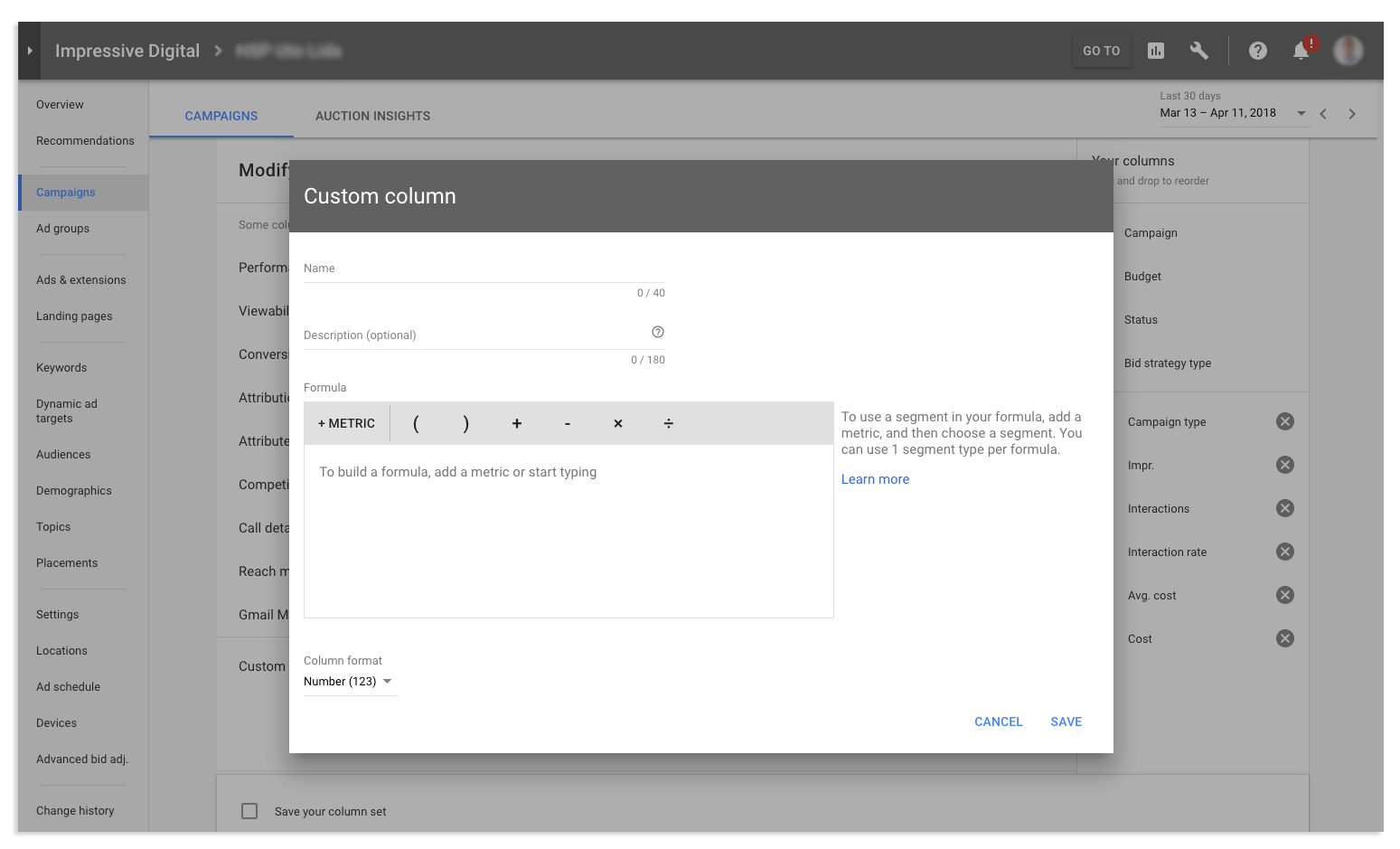
The 2018 Google AdWords updates now allow us to develop and measure custom metrics at the keyword and ad level, not just at campaign and ad group level like before.
You can now create custom columns within the keywords or ads tabs and can even customise metrics based on your choice of conversion or performance elements. This is useful to analyse the performance of specific keywords in detail, instead of only looking at overall performance of campaigns or ad groups.
The customisable options are almost limitless, so you can get deeper with your analysis.
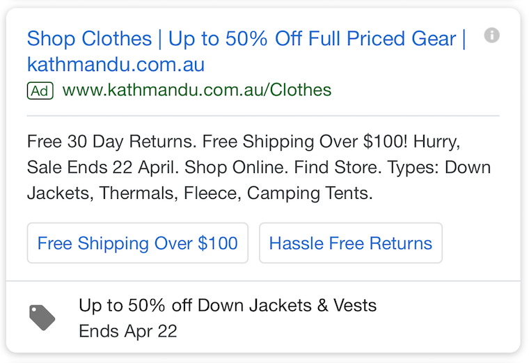
We can now Use Promotion Extensions
Before the overhaul, it was difficult to create engaging copy in headlines and descriptions. That’s because Google only gave us 30 characters and 80 characters respectively. There was only so much to play around with, so copy was often boring and only focused on selling, not creativity.
Promotion extensions now let us add another section of information to our ads. You can use this to show specific products or campaigns, and it’s especially useful for holidays like Christmas, Valentine’s Day or Black Friday.
This is customisable, too. You have full control over the devices they are shown on, and when they should be shown. The new feature seems to be working a treat – Google found that companies using this feature are seeing a lift in conversion rates by 20-30%.
Now, you have some extra space for CTAs, value propositions and promotions.
Custom intent audiences
The new custom intent feature is such a big deal, we wrote a whole blog post about it.
This feature allows for better demographic targeting and audience management, to make your campaign a lot more effective at making sales and converting.
Display network ads now have much better targeting options that give you 2 choices:
- Input data such as topics, URLs and keywords to let Google know who you want to target
- Let AdWords use machine learning to automatically create an intent audience
This detailed customisation sends your message to customers that are demonstrating some intent to buy products or services similar to yours.
Summary: Do we Love or Hate the New AdWords Interface?
 They may take some getting used to but dedicating some time to navigating the new interface should show advertisers that for the most part, the changes were smart and helpful for us.
Mitch Cameron, Head of Paid Search at Impressive, has had mixed feelings about his interactions with the new Google AdWords Updates. He said:
“Overall, Google is trying hard to modernise their platforms and bring infrastructure and software that was built years ago into 2018, but like all design, it’s a delicate balance of form AND function, and unfortunately Google hasn’t yet found that balance. While it may be prettier with dynamic graphs and more colour, it’s actually harder to do basic changes and requires a lot more effort from the user. Kudos for trying, but this seems like a solution looking for a problem.”